NMIX 6110 Project Two
Panel One

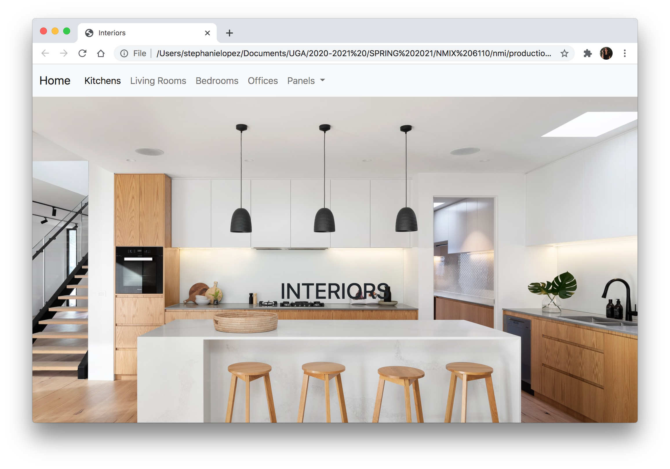
Creating the first panel for project two was honestly a bit difficult. I had some trouble finding exactly what I wanted for my website on getbootstrap.com. With panel one, I was able to create a good outline for what I wanted my website to look like, but I didn’t stylize it as much as I wanted to. One thing I struggled with on panel one was centering the text vertically in each grid column. For some reason, the solutions under the vertical alignment tab on getbootstrap.com would not work. I was able to figure out how to vertically center it by doing a quick Google search. I learned that adding “my-auto” to the div class will center that element in its flexbox container. One thing I do enjoy with bootstrap is how simple and easy it is to add in components like a Navbar.
Panel Two

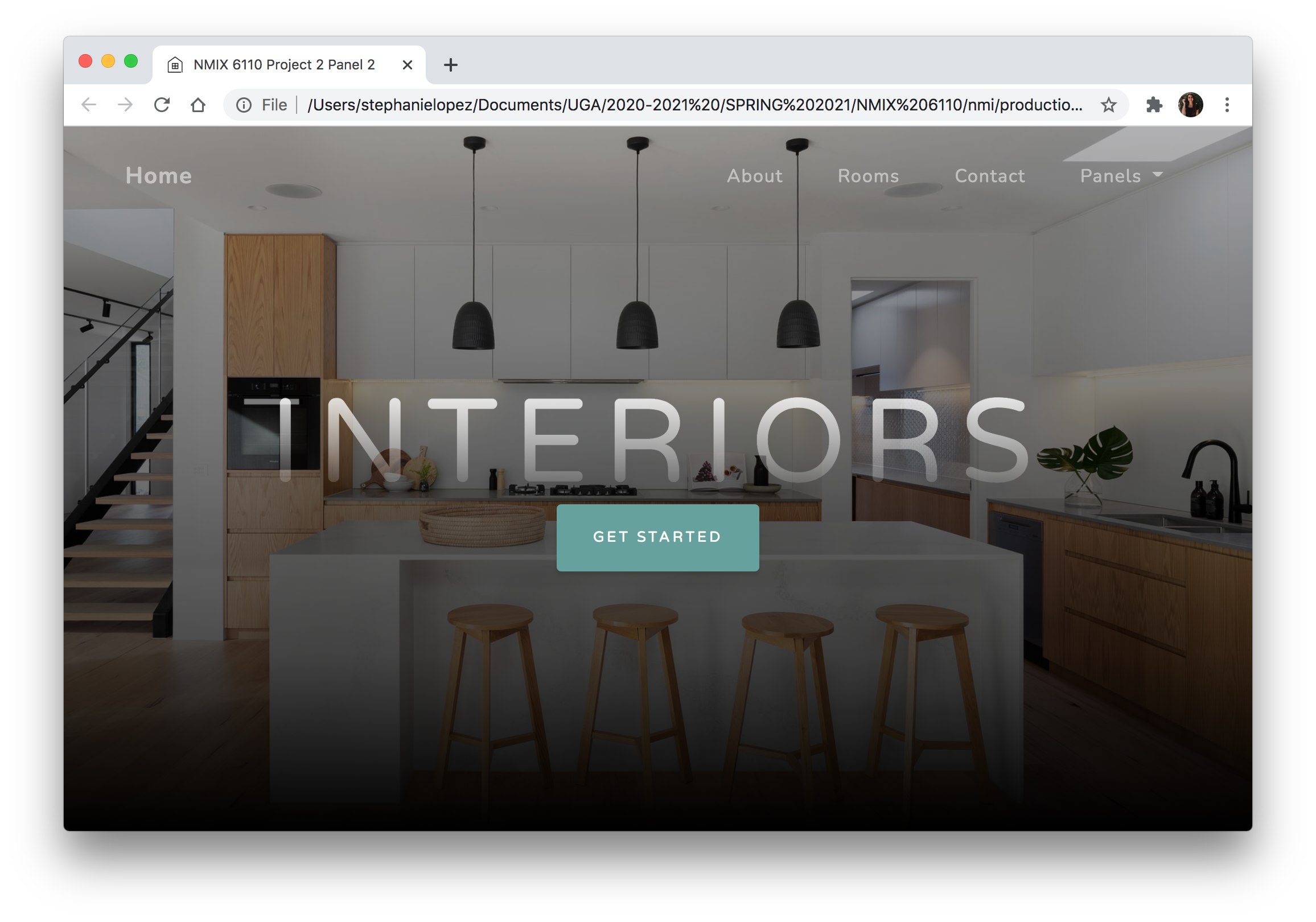
Panel two for project two was a lot easier to create than panel one. I really enjoyed browsing through the different themes and templates for bootstrap websites. When looking through the different templates, I mainly considered the format of the template rather than the contents and colors. I knew I would be able to change out the colors in panel three, so I focused on finding a template that would complement the content of my website even if the colors wouldn’t.
Using a template to create my website was a lot more efficient than creating it from scratch—I could just add in my content and make adjustments where needed instead of having to code each line by hand. One small detailed that I’m proud of figuring out with panel two is figuring out how to change out the tab icon. I always wondered how to switch it out and the theme I chose had a line of code for the icon, so I changed it to be a house which matches the website content. I didn’t realize how easy it would be, and I’m excited to implement this in other projects in the future!
Panel Three

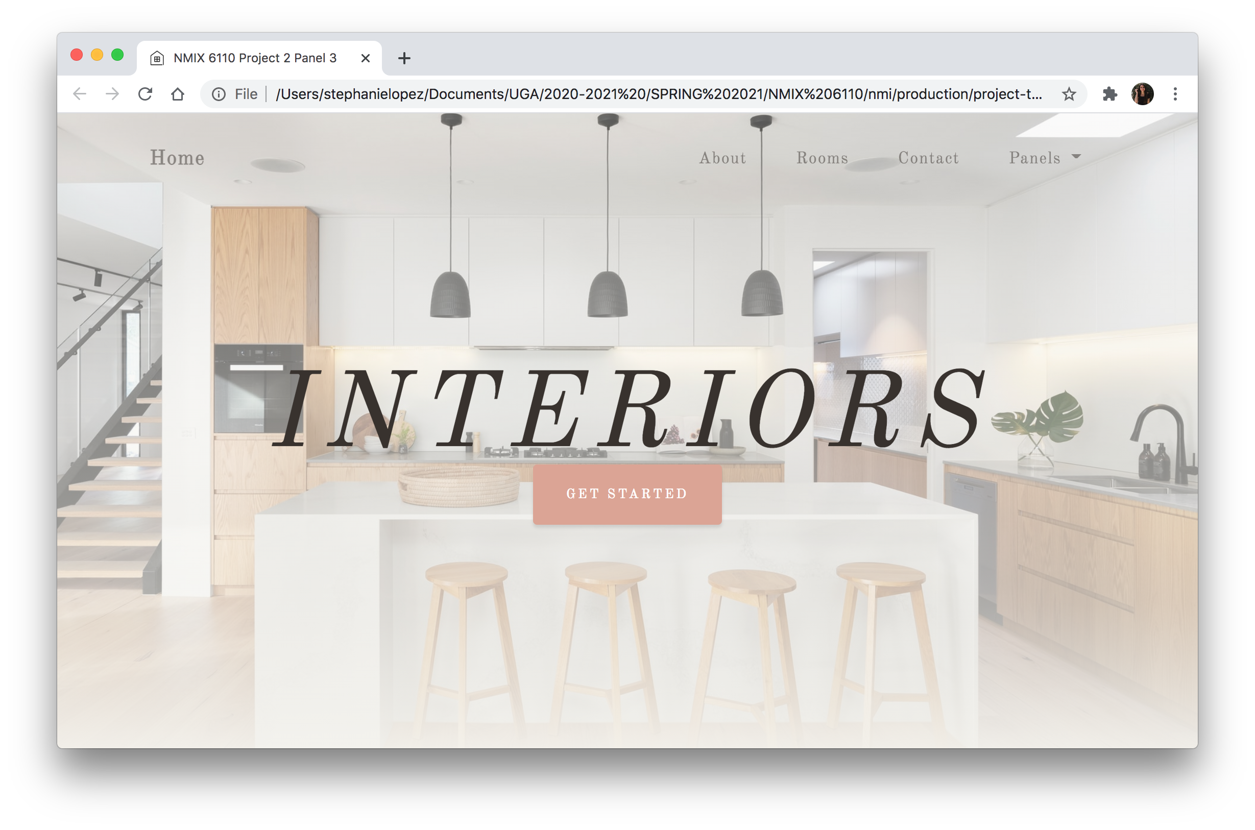
Panel three is definitely my favorite out of the three panels. I really enjoyed customizing the CSS elements for panel 3. Similarly to project one, I looked through Google Fonts and coolors.co to find fonts and a color palette that would complement the content of my website. For the color palette for this website, I wanted to keep it bright and airy to match the feeling of the spaces in the photos. One thing I didn’t realize until I started customizing panel three was that there were many elements on the page that were the teal color from the theme. The buttons, hovering over the buttons, the navbar, hovering over the navbar, and the lines under the text were all originally teal and needed to be changed to the new pink color. It was a little difficult trying to find all of the elements that needed to be changed, but I utilized the inspect feature on Chrome to figure out what the elements were called so I could then change the colors in Visual Studio Code.