For our final project, we were tasked to redesign a current customer experience to make it better. I chose to redesign the app BeReal, specifically the friends’ profile page. Below, you can read about my project, view the prototype, and watch the presentation video.
Redesigning BeReal
About BeReal
Founded by Alexis Barreyat and Kévin Perrea in Paris, France in 2020, BeReal is a social media app that promotes authenticity. Users receive a notification once a day, every day, at a random time. Users are then prompted to take a photo using both the front and back cameras and share it within 2 minutes of receiving the notification. If a user misses the notification, they are still able to share a post, but their post will say how late it was posted. Also, users are not able to see their friends’ posts until they share their photos of the day.
Unlike other popular social media sites, BeReal is more fun and casual by eliminating users’ ability to edit their photos. The app has recently gained popularity among Gen Z, and its users have grown by about 315% since the start of 2022 according to Apptopia.
People enjoy using BeReal because it’s not stressful and overwhelming like other social media platforms. For instance, on Instagram, people spend hours taking and editing their photos making sure that it’s aesthetic enough to post in order to get more followers and likes. BeReal, however, does the complete opposite. Follower and like counts are not emphasized on the platform, and people are encouraged to post their real selves. BeReal’s app description on the App Store even says:
“BeReal is life, Real life, and this life is without filters. BeReal won’t make you famous. If you want to become an influencer you can stay on TikTok and Instagram.”
This is why people find BeReal appealing. The casual nature of the app allows people to feel less stressed about posting, and as a result, is more fun.
The Problem
Currently, users are only able to see their friends’ photos from the current day. Users are able to see their own memories, but they cannot go to their friends’ profiles to see what they have posted in the past.
As a user, this is frustrating because sometimes I want to look at what my friends were up to in the past. Either I will take a BeReal with a friend that I want to see again, or I just want to see what my friends were up to. However, when I go to a friend’s profile the only thing I see is their profile picture, mutual friends, and nothing else.
Not being able to see friends’ previous post from their profile is also an issue because not everyone will post at the time they receive the notification. People may be busy and won’t see the notification until later on and will thus post a late BeReal. If you aren’t checking the app throughout the day after posting, you may miss a friend’s post. If you wanted to go to your friend’s profile and see the post you missed, you wouldn’t be able to because there is currently no option to view previous posts from your friends.
When users on other social media sites click on a profile, they expect to see that user’s past posts. BeReal currently does not meet these expectations, so users are disappointed when viewing friends’ profiles.

The Process
Consumer Profile
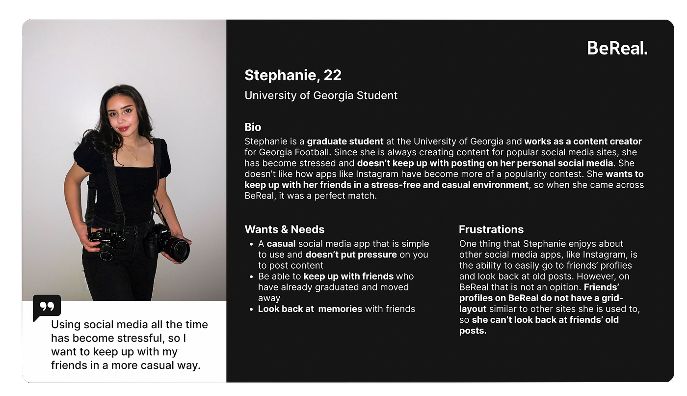
I started to identify the above problems by thinking about a consumer of the app BeReal. As an app that is becoming more popular with Gen Z, BeReal’s target audience is someone similar to me: a young adult who is tired of the perfectionist nature of social media and wants to keep up with friends in a relaxed manner.

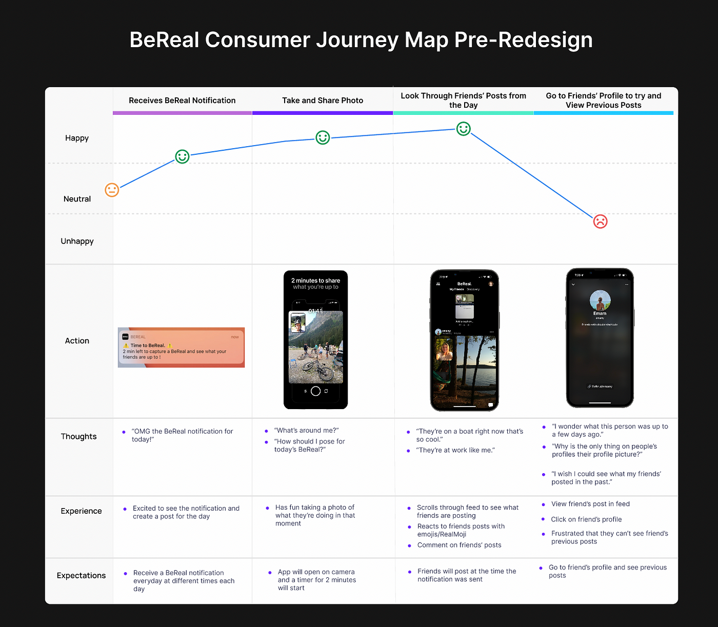
Pre-Redesign Customer Journey Map
Before jumping into creating the prototype, I thought about the consumer profile I created of a BeReal user and what their thoughts, experience, and expectations are when using the app. The below consumer journey map assumes the user already has the BeReal app downloaded, and it shows the process of an average BeReal user using the app from when they receive the notification to viewing a friend’s profile.

The Solution
Prototype
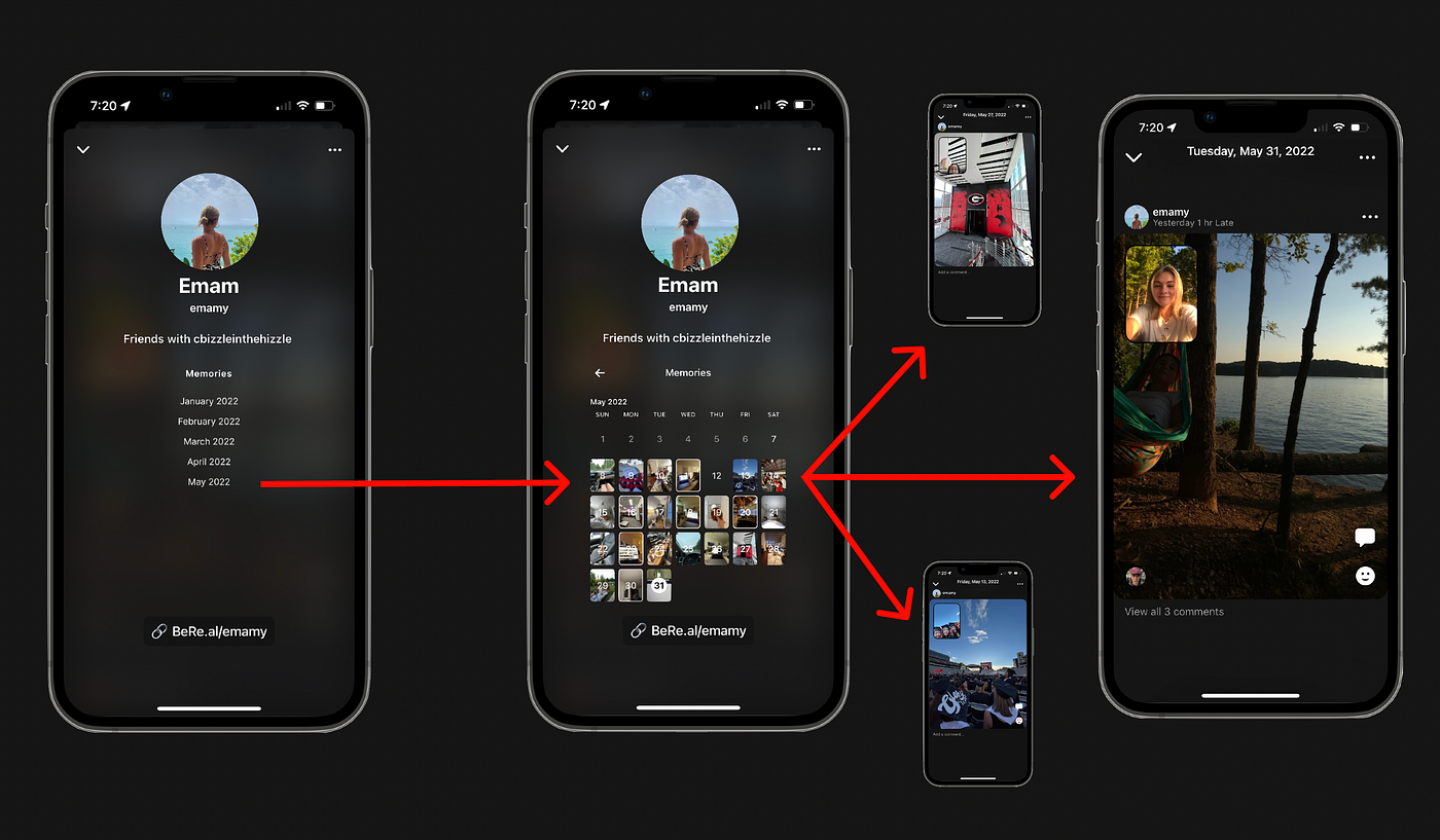
The redesign employs a grid-like layout on friends’ profiles. This grid-like layout is similar to other social media sites, like Instagram, that users are already accustomed to. With the redesign, BeReal users will be able to easily look through their friend’s memories when clicking on their friends’ profiles.
When clicking on a friend’s profile, users will be prompted to click the month they would like to see. They will then be able to see that user’s post for the month and click on each post to view any comments or reactions.

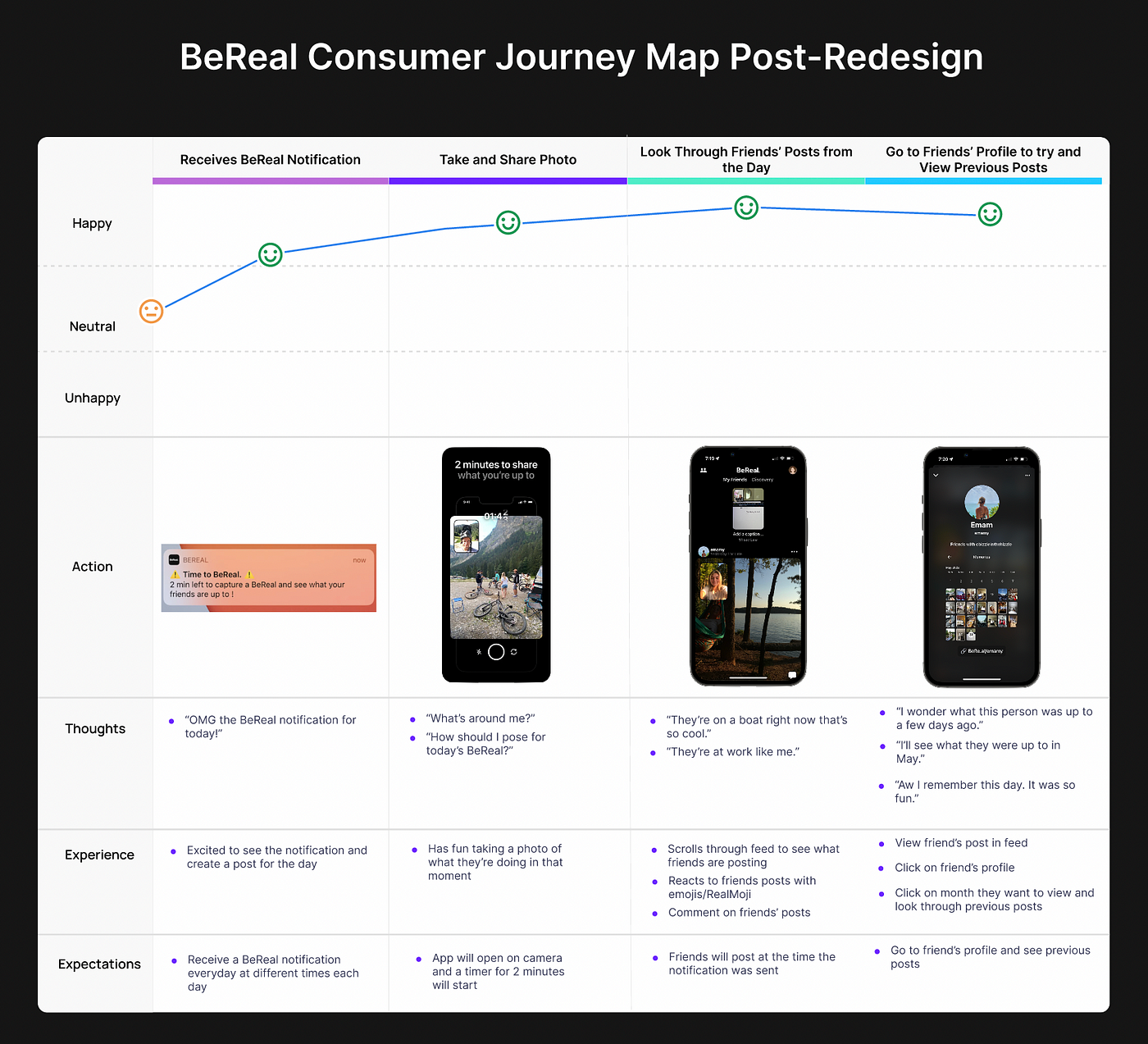
Below is an updated consumer journey map after the redesign. As illustrated, users will no longer feel disappointed when viewing a friend’s profile. The user’s expectations are now met and can reflect on past memories from their friends’ profiles.


