
Reflection
For my final project, I decided to redesign the Zell B. Miller Learning Center website. I work at the MLC as an administrative assistant, so I have become very familiar with the website over the past year as I had to search for information to answer student questions.
As an administrative assistant at the MLC, one of my tasks is to answer the phone and respond to any questions students may have. People typically ask questions about MLC’s hours, study rooms, and the technology lending program. The answers to most of the questions asked are typically on the current MLC website. However, the pages on the current website are disorganized, and it is difficult for students to find the information they are looking for. Most pages also have long paragraphs of text which makes it difficult to digest the information. As a result, one of my main goals in the redesign was to condense the pages and information to make it easier to find.
Before tackling the redesign, I looked through the current MLC website to see what needed to be changed and brainstormed how to fix these issues.

While brainstorming, I mainly focused on figuring out how I could improve the navigation bar and which pages to redesign. The current MLC website has about 35 pages, and with the project timeframe it was not possible to redesign every single page on the current website. Because of this, I decided to focus on redesigning the pages with the information students are typically looking for which were the home, about, study room, technology lending, and contact pages.
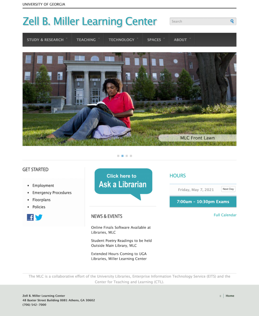
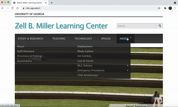
The main issue with the current MLC website is that it is outdated and does not follow UGA’s brand style guide. MLC’s current website has a blue color scheme, and it does not use the fonts the university uses on their other websites.
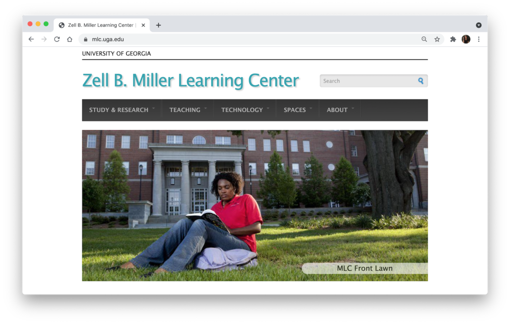
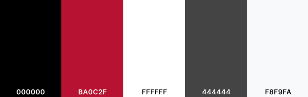
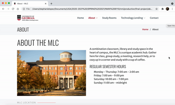
Throughout the redesign process, I consulted UGA’s brand style guide to see which color scheme and fonts to use, so the new MLC website would fit UGA’s brand. I mainly used UGA’s primary color scheme of Arch Black, Bulldog Red, and Chapel Bell white as well as the fonts Oswald and Merriweather Sans. I used the Bootstrap template “Sailor” for the redesign because the layout was similar to other UGA sites, and I liked how it had multiple pages rather than just a one-page site.

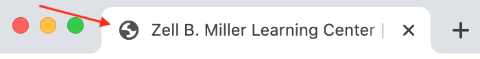
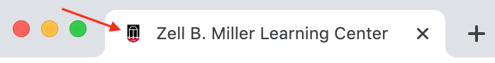
Another issue with MLC’s current website is that it does not have a UGA branded favicon. Although small, adding in UGA’s favicon to the MLC website redesign further increased UGA’s branding.
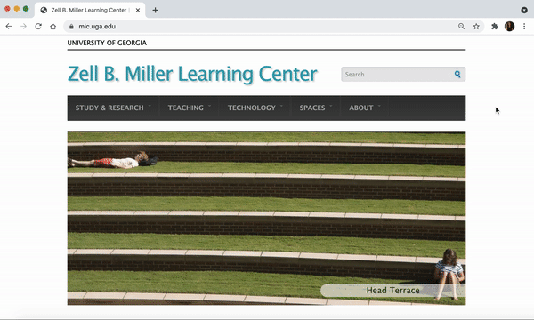
The first things you see when looking at the current MLC website homepage are outdated images that are pixelated. I looked through uga.widencollective.com to find updated and high-quality images to feature on the homepage carousel. The new images on the site invite viewers to continue scrolling through and viewing the website.
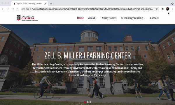
I added sections to the homepage that link to the about and contact pages for easy access. There is also a section on the new homepage that features the different spaces the MLC offers. The Group Study Rooms box links to the Study Rooms page. I would have created pages for the other spaces (classrooms, digital media lab, presentation practice rooms, event spaces, and food and drink), so each box would link to their respective pages. However, because of the project time constraint, I chose to focus on redesigning the pages with the most important information.
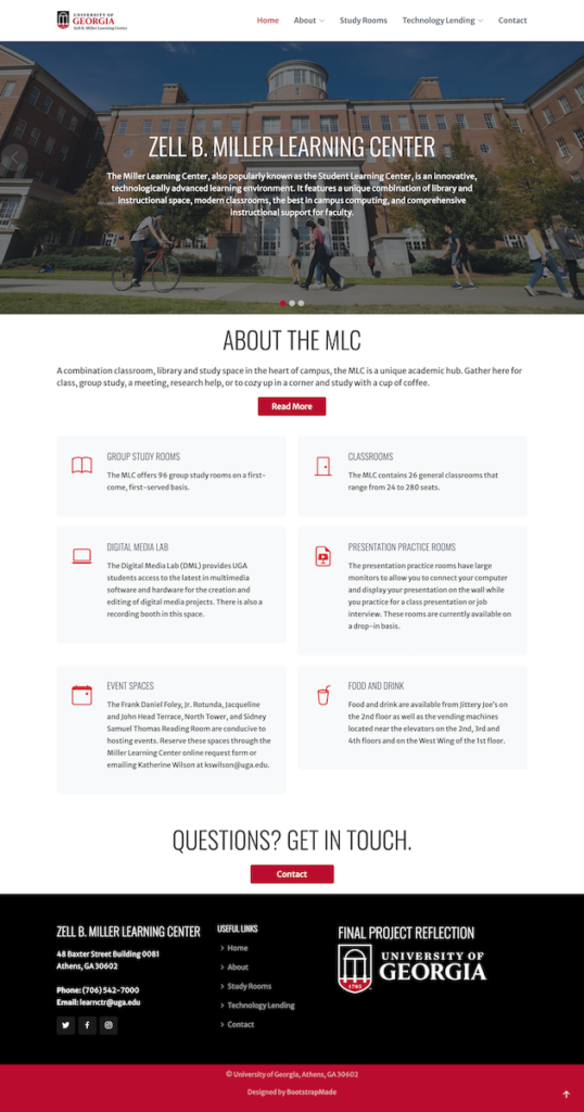
When first planning out the redesign, I noticed that most of the pages under the about section on the current site could be condensed into one page. In the redesign, I combined hours, location, accessibility, and student employment to all fit onto one page. They also each have their own sections and can be reached from the drop-down menu on the nav bar. The text on the original site was all the same size and one color. On the redesign, I incorporated headers and UGA’s “Bulldog Red” color to make the page more interesting and easier to read.
The most time-consuming page to redesign was the Technology Lending page. The information on the original page was disorganized, and the text was all the same size which made it difficult to find any answers to question you may have. My main challenge while redesigning this page was trying to figure out the best way to reorganize the information, so the flow on the page would make more sense. I used headers, icons, and the Bulldog Red color to make the page more interesting and easier to navigate. The original page had questions with answers randomly displayed throughout the page. In the redesign, I created a “frequently asked questions” section with the questions in one column and the answers in the second column next to the questions. The new FAQ section would allow for viewers of the site to easily find the answer to a question they have.


Overall, redesigning the MLC website for the final project was time-consuming, but was also very rewarding. Using a Bootstrap template was difficult since I couldn’t easily find plugins like on WordPress, but I enjoyed the challenge and am very proud of the end result. I loved being able to combine the design, HTML, and CSS skills I have learned throughout the semester and applying them. It was very satisfying seeing how much a big difference changing simple things like colors and fonts could make to the website.